
Google announced that it will be expanding its use of “mobile-friendliness” as a ranking signal beginning on April 21. That gives you a little less than two months to make sure your site fits the bill. The change will go into effect across all languages, and Google says it will have a “significant impact” in its search results.
You know if Google is saying the impact is going to be “significant,” it’s probably not something to take lightly. As a result of the change, Google says users will find it easier to get relevant, high quality search results optimized for their devices.
“When it comes to search on mobile devices, users should get the most relevant and timely results, no matter if the information lives on mobile-friendly web pages or apps,” says Google in a blog post. “As more people use mobile devices to access the internet, our algorithms have to adapt to these usage patterns. In the past, we’ve made updates to ensure a site is configured properly and viewable on modern devices. We’ve made it easier for users to find mobile-friendly web pages and we’ve introduced App Indexing to surface useful content from apps.”
Now, they’re getting ready to implement the expanded ranking signal and also, starting today, they’re using information from indexed apps as a ranking signal for signed-in users who have said apps installed. Users may start seeing more content from apps they use displayed more prominently in search results.
With regard to mobile-friendliness, Google notes that it has talked about such an algorithm update in the past, but that this is the first time it’s attached a date to it.
Throughout 2014, Google made quite a few moves showing it was focusing on improving the mobile search experience for users. In November, they added a mobile-friendly label to mobile search results for sites that meet the criteria. The company mentioned that it was experimenting with using the same criteria for a ranking signal.
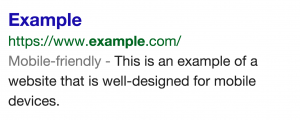
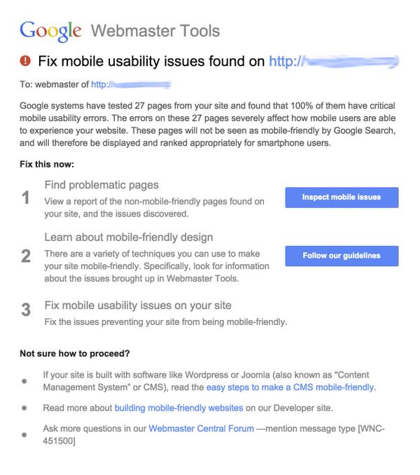
Last month, webmasters were getting warnings from Google when their sites weren’t mobile-friendly, suggesting that that ranking signal might be creeping up. It’s not a surprise that Google is about to implement it, though it is somewhat of a surprise that they gave a launch date. They’re not usually so kind in announcing these things.
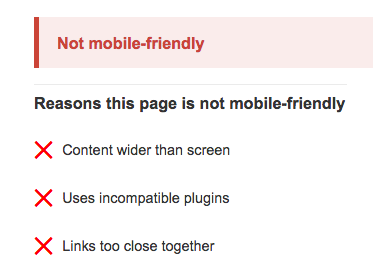
Here’s what the webmaster warnings look like:
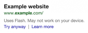
When Google announced the labels, it also laid out some criteria for earning them. For one, a site should avoid software that isn’t common on mobile devices. It specifically mentioned Flash, following its previous shaming of Flash sites in mobile search results when it started showing messages in mobile search results for sites that may not work. Messages said things such as “Uses Flash. May not work on your device.”
Google says sites should use text that is readable without zooming, and should size content to the screen so that users don’t have to scroll horizontally or zoom. Links should also be placed far enough apart so that the correct one can be tapped easily.
Google has a Mobile-Friendly Test tool here. You can enter a URL, and Google will analyze it and report if it has a mobile-friendly design.

If a URL passes the test, it will tell you that the page is mobile-friendly, and give you some additional resources, including information about how Googlebot sees the page.
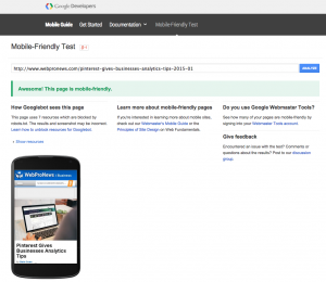
If the URL fails the test, you’ll get reasons why the page isn’t mobile-friendly, as well as info about how Googlebot sees it, and resources to help you fix issues.
Last fall, Google Webmaster Tools added mobile usability tracking. This includes graphs that look at mobile issues over time, so you can see any progress you’ve made.
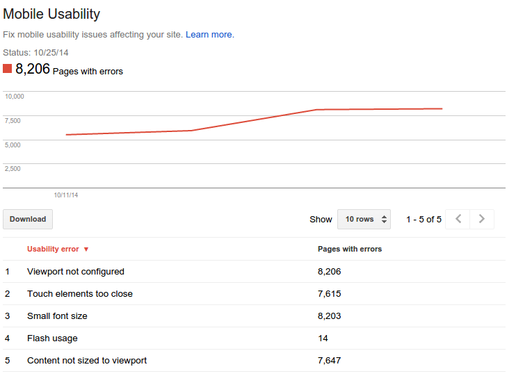
“A mobile-friendly site is one that you can easily read & use on a smartphone, by only having to scroll up or down,” said Google’s John Mueller at the time. “Swiping left/right to search for content, zooming to read text and use UI elements, or not being able to see the content at all make a site harder to use for users on mobile phones. To help, the Mobile Usability reports show the following issues: Flash content, missing viewport (a critical meta-tag for mobile pages), tiny fonts, fixed-width viewports, content not sized to viewport, and clickable links/buttons too close to each other.”
“We strongly recommend you take a look at these issues in Webmaster Tools, and think about how they might be resolved; sometimes it’s just a matter of tweaking your site’s template!” he said.
If you have a mobile app, don’t forget the app indexing signal. You can find a step-by-step guide on getting it set up here. This might be more motivation for some businesses to build mobile apps. On top of that, Google just announced paid search results in the Google Play store, so Android apps will get some new visibility opportunities there. This is only in the pilot phase for the time being, however.
You can test your website here :https://www.google.com/webmasters/tools/mobile-friendly/
Read the original post at Webpronews.com
